Visiting one of my favourite sites, and sources of inspiration, Behance, for Wes Anderson- inspired design- ranging from Illustrations, Graphics, packaging, and so on...these designs have really got me excited for my potential future and development throughout this 'What is Good?' project...
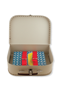
Love these packaging and DVD cover designs by Graphic Designer Nicole Cahill. Inspired by the now iconic Louis Vuitton suitcase in Anderson's 'The Darjeeling Limited'...the suitcase packaging is rather adorable, and ensures that you will never have to be without them...love the decorative, consistent series design of the covers...only a shame that more designs couldn't have been made to complete the set!
Nowadays, I'm quite the sucker for vector character design, so I was easily drawn to Corey James' designs for Faber film book covers- featuring many of Wes' famous characters- perfectly suited to this type of illustrative design due to their often iconic and symbolic dress, costume and appearance.
Sweet and simple minimalistic poster designs- saw an instant inspiration from Saul Bass' designs- a simple narration of some of the iconic scenes in the films. Good textures used.
Great, simple vector design minimalist posters by Graphic Designer and Wes Anderson fan, Justin Mezzell. Really like the simple, iconic illustrative style, with, naturally, Futura Bold. Again, great textures- adds a great deal more interest to an otherwise flat image.
The Wes Anderson alphabet- created by Hexagonall. Fun idea, with simple imagery that, thanks to Wes' eccentric and ecclectic costume choices, represents the iconic characters with ease.
This is how I live my life, I swear. Great inspiration and key points for what will, I am sure, become my 2-3 minute presentation on why Wes is good for the rest of the GD group when we return in September.
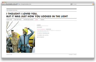
Please excuse my French but...MERDE! This project is...amazing...exactly the sort of thing I hope to achieve. Here, Amercican Graphic Designer, Alex Cornell spent a summer designing for a ficticious Wes Anderson film festival, fully branding and promoting items- ranging from vinyl of soundtracks, a website, tickets, stationary, posters, a book...just wow. I would seriously LOVE to do this. My initial thought, when embarking on this Wes Anderson project, was to create a sort of interactive media book- with pull out posters, reviews, flaps, intricate folds and great layout designs- this has completely inspired me. Slick, stylish, and totally Wes- I want to make something like this. My inspiration is soaring. Best get booking myself into some book binding sessions...


No comments:
Post a Comment