Graphic Design researched and sourced from Secondary source examples- inspiration for future designs in print/web if I were to persue the 'baking' project to my final design in this 'What is Good?' project.
I love this 'chemistry of cake' design by designer Abby Rutt. Cute, candy colours and simple pictograms make for a strong infographic design with the human, and rather feminine touch. Simple, but with enough flair to maintain interest, and stand out from the crowd.
Cool branding design for 'Baked' in San Fransisco- a 24 hour bakery by Wade Winnebrenner. Here, he combined a 1950's style with a contemporary look for a unique and distinctive design- love the logo typeface, looks almost a little 1960's with the retro rounded-corners style.
Cute branding design for 'Amy Bakes Cupcakes' by Lauryl Kuntzman- feminine, fresh colours with simple and ~charming~ vector Illustrations. Communicates the style of the company very well.
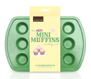
Super-cute packaging for the kid's cookery range at Lakeland by Design co. nicepond- again, simple vector Illustrations combined with creative and playful typography make for an eye-catching design which kids and adults alike will certainly be attracted to.
Amazing papercraft designs for Australia's 'Women's Health' magazine, created by designer Benja Harney. Really, this is the sort of aesthetic that I wanted to achieve with the 'Speaking from Experience' project (see www.s-wilson1013-dp.blogspot.com for more details!) but didn't really have the skills/time to achieve. Love the block colours and organic shapes. Very happy looking indeed.


No comments:
Post a Comment