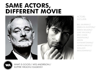
The slides from my 'What is good?' PowerPoint presentation to show and read through to the rest of the Graphic Design group (and tutors) the day after we return to Uni on the 21st. Reasonably happy with how it's looking- already a noticeable improvement from my last PowerPoint at the end of term. Having the Futura guidelines has certainly helped to maintain a visual consistency...allowing me to be clear and direct with my message- and having some pretty wonderful resources of screenshots to boot.
Not too worried about how it looks for now- will undoubtedly come back to it a few days before the presentation to make any necessary tweaks. Also hoping to make a printed booklet/guide to his films as a hand-out...all time permitting, however. Definitely something to try to develop and consider this coming week.


Hello, i'm Federica.
ReplyDeleteI found this blog while I was seeking for a depth analysis of Wes Anderson's artistic activity.
I'm impressed about your work.
I'd like to watch your powerpoint presentation, if it is possible.
Here's my contact : laforgiafederica@gmail.com
I hope to hear from yoo soon
Federica